Thursday, February 28, 2013
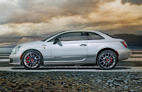
Fiat 750: Elegant Two-Seat Abarth Coupe
Artandcolour's more elegant Fiat sports coupe, the 750 Abarth. Top-spec 500 Abarth drivetrains with longer and lower-yet-lighter bodywork. Rear seat is tossed in favor of fitted luggage and a fold-down bulkhead. Accordion-like folding roof continues with its structural side roof rails.
Wednesday, February 27, 2013
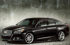
New Malibu Facelifted for '14
Sleeker Malibu might be an easier sell next to Ford's svelte new Fusion.
2014 Chevrolet Malibu sedan—At first, all I wanted to do with the new 'Bu was change the grille. I wanted to do away with the now-dated dual openings but didn't want to give it the new Impala's Camaro-like grille. The first thing I did was unify the openings and then I started leaning the ensemble forward and backward. I settled on this Mercedes-like proud front grille and hood shape. The opening textures would remain simple eggcrates and meshes as this upscale version sports. Then when I saw the way the new front end seemed defiant, almost leaning into the wind, the rest of the car seemed to want to be more aero. I gave it a 6-window greenhouse and introduced a few slight arcs to the fenders. I also dialed back the almost bug-like rear lights and cut-back trunk lid. That's the production car's biggest flaw in my opinion, the design of the rear of the car. I filled out the corners and sliced the taillights into a clean, modern shape. I also changed the contours of the rear bumper.
While no raving beauty—this is really a tall platform—I think my Malibu would stand up quite well with the Fusion and Altima and Camry. The new grille treatment would work on smaller as well as larger cars, too.
Tuesday, February 26, 2013
Continental for 1958
Opalescent Pistachio Point Green lacquer perfectly highlights the lines of this Wixom-built '58 Continental coupe. Altering the new-that-year unibody Lincoln, I changed the proportions for more of a personal coupe appearance. The hood length looks back to the Classic era consisting of almost half of the length of the car. The four passenger interior would have been based on the '58 Thunderbird, itself brand new that year and also built at the fabled Wixom plant. The roof would have been available in linen-covered steel or brushed stainless to match the front fender coves.
And, yes, I started out with the regular Lincoln that year, not the upscale Continental. This mockup would have been early in the process and trim was still being mixed and matched and developed...
I also left off the spare tire hump... Rocketships don't need no stinkin' spare tires, lol.
And, yes, I started out with the regular Lincoln that year, not the upscale Continental. This mockup would have been early in the process and trim was still being mixed and matched and developed...
I also left off the spare tire hump... Rocketships don't need no stinkin' spare tires, lol.
Monday, February 25, 2013
2014 E-Series TurboDiesel Hatchback: The Professor?
Sensible and SENSATIONAL! This is my idea of a Mercedes I'd love to see Stuttgart build: An E400TDI-h. For this "professor's" Benz, I've brought back the idea of a longitudinally mounted inline 6-cylinder turbodiesel powerplant, this time with a hybrid-assisted drivetrain. There is a practical hatchback in the rear and with careful aero-tuning I'd predict a nice round 50mpg of fuel-sipping diesel in combined city/highway driving. As much as I loved the first generation CLS 4-door coupe, the new one falls short for me and I'd rather have seen a fastback/hatchback E-Series instead!
The background is a detail from a watercolor painting I found hidden behind the cardboard of an antique frame. There was a second painting, too. Story at my artandcolour blog: here.
The background is a detail from a watercolor painting I found hidden behind the cardboard of an antique frame. There was a second painting, too. Story at my artandcolour blog: here.
Thursday, February 14, 2013
2014 Buick Invicta: Entry Level Convertible
2014 Buick Invicta. This is a pretty straight forward Opel-to-Buick chop, the base photo being the new Opel Cascada convertible. For this Buick version, I lengthened the rear trunk and overhang for a more balanced appearance, and I reprofiled the roof to include a much wider rear window. I'd actually like the rear window to wraparound slightly, so I think it might need to be three pieces, with slender frames, and they'd all nicely fold into the boot area. That would be a neat look back at Buick's 3-piece rear windows on the many of their '57s. I also added the black/chrome rocker moldings, the Ventiports and Buick grille and gave it a sparkly cherry paint job. I would position this at the Verano level in Buick show rooms, in the $32-35,000 range. It would be a nice bookend to the eventual Buick flagship coupe/convertible, the Riviera.
Sunday, February 10, 2013
2013 Impala Coupe-Sixties Inspired
All the planets have aligned in the past couple of days to give me time to do some chops. Finally! Above, the Impala 2-door coupe. Even with the vastly different proportions from the 1960s platforms, I've tried to give my coupe the feel of the '65-'68 fastbacks. I also emphasized the rear fender swage line. I think it recalls the '58's rear shoulder line now, the first year of the Impala. I added rocker panel trim to the rear quarters to try to make the rear overhang appear longer, another nod to the past.
Saturday, February 9, 2013
2014 Corvette Stingray; Alternate Styling B
For my second take on the C7, I decided to keep the idea of a rear quarter window, but I reshaped it into a much simpler graphic. By bringing this new side window to a point, I referenced the Corvette supercar prototype from the 1970s, the mid-engined 4-Rotor.At the back I created a set of aluminum-ringed quad circular taillight and replaced the new "V" crossed flags emblem with a "proper" set of flags from '72 'Vette. I cut down on the visual height of the bodysides by using another '70s styling trick: Argent colored rocker panels.The cool new Stingray logo has been moved to the B pillar when it's noticeable every time you open the door. Then in a nod to Harley Earl and Bill Mitchell, I
gave Welburn's oversized (and now body-colored) side vents dual chrome
strakes. It's a minor point, but I made the glass roof and rear window graphic read as one large tinted panel by glazing over the "baskethandle" instead of painting it body color. I think it unifies and simplies the C7's shapes and details.
Thursday, February 7, 2013
2014 Corvette Stingray split-window
The Split-Window is Back! For my take on the new C7 Corvette Stingray I went backwards in time a bit. To begin with I restored its traditional four round taillights. I gave it a much more traditional greenhouse rather than the new car's first time and rather forced rear quarter windows. I also added a thin central paint-colored spine to the hatchglass, following the existing indented roof panel. I also edited the side vents so they'd fit better with the last several generations. Detail changes include moving the new Stingray logo to the B pillar and flattened out the new "winged" crossed flags. That newest touch just smacks of the Firebird's past logos an odd touch with the new car's Camaro-like taillights.I don't think the 'Vette needs to have any "Chevrolet" cues other than perhaps similar LED lighting details, road wheels, steering wheel and Sat/Navs.
For a second C7 "facelift" click here.
For a second C7 "facelift" click here.
Friday, February 1, 2013
1996 Honda Accord. With Scissor Doors!
Not a chop of mine, and certainly not a car one sees everyday: A 1996 Accord LX 4-door sedan in "survivor" condition with mega-bucks scissor doors! I found this car in town yesterday and asked if I could take some photos. These young guys were pretty convivial. The tall guy in the center of this photo seemed to be the owner and was enjoying the ironies his car presents. I didn't even ask "why" because it didn't matter to me in the least.
The world is a better place with this car in i.
The world is a better place with this car in i.


